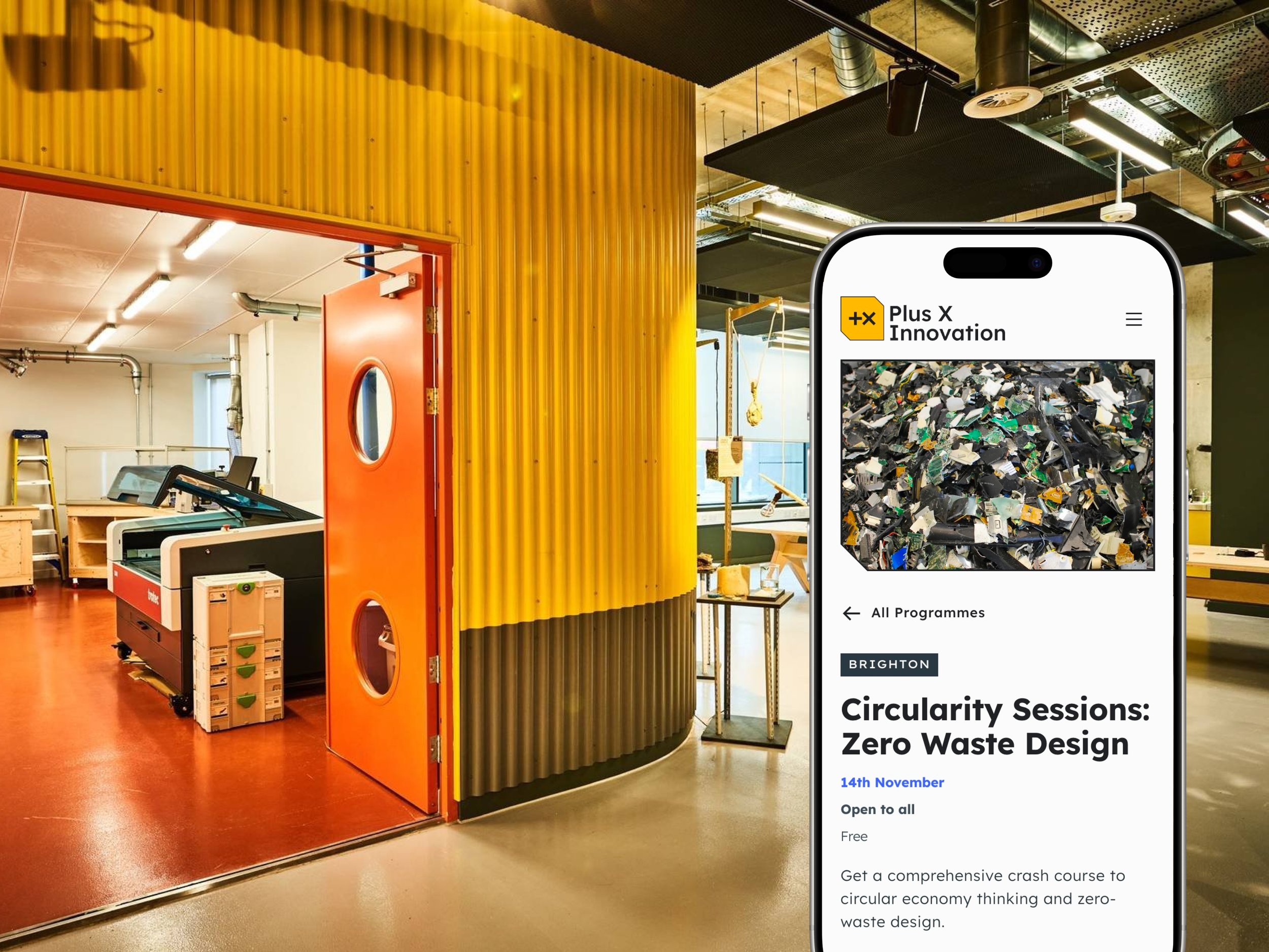
Plus X Innovation
Brand identity and website launch for workspaces focussed on sustainability and inclusivity
Brand Identity and Product Design
Sector
Workspace and innovation
Service
Brand identity, creative, product design, marketing design
Team
Creative & product lead: Myself
Brand advisor: Bill Wallsgrove
Digital marketing & CRM: Rosie Ashman
Content strategist, copywriter & SEO: Rosie Murphy
Website design and development: Altiverse
Creative designer: Doris Xiaoyu Chen
Designer & art director: Chris Pelling
Videography: Zachary Hyland
Motion design: Oscar Maydon
Target audience
Startups, scaleups, corporates, educational institutes, local community, local and national government, freelancers.
The opportunity
With 4 operating brand guidelines within 2 workspaces, customers were confused which brands meant what, with no understanding if and how they were related. The fantastic opportunity within this large project was to come up with a way to propel the business into opening new locations, with a clear message about who they are and what they stand for.
Approach
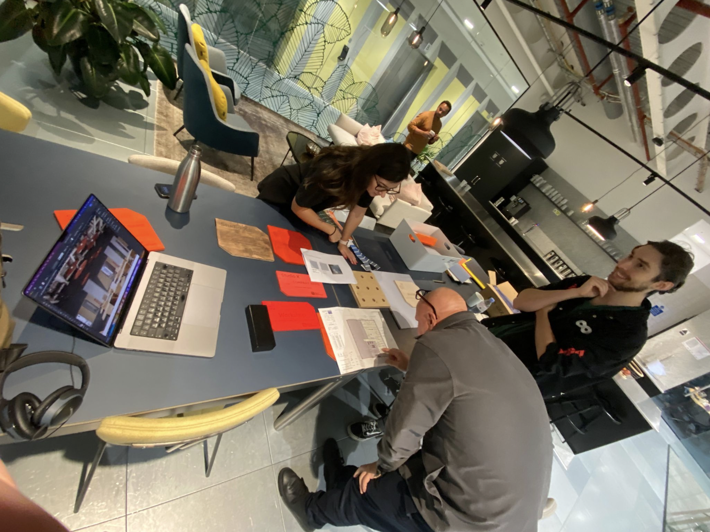
I started with desk research, collating every piece of marketing, sales and product output from the business to understand what was going out to market, alongside internal customer analysis documentation. Huge volumes of work via the operating brands for a very small production team maintain.


Physical space lacking relationship to guidelines
Research
I started with an in depth discovery, untangling ambiguity into strategy using a mixture of the following methodologies:
Brand
Stakeholder workshops and interviews
Brand architecture workshops & research
Direct, indirect and potential competitor analysis
Environmental contextual research
Guerilla customer research interviews
Online survey
This research confirmed that customers were unaware the brands connected, additionally that the brand guidelines throughout the customer touch-points had no cohesion. Customers were also unable to consistently read +x as plus x, creating a clear need that the words needed to be included in the name, examples ‘add x,’ ‘plus multiply’.
Product
Cross departmental stakeholder workshops to connect thematics of business units
Cross departmental stakeholder and partner research to define product stacks and integrations
Direct, indirect and potential competitor analysis
Heuristic evaluation of existing websites journeys
Persona creation through membership database and stakeholder interview analysis
Customer journey mapping and user journeys
Content audit of all 4 websites
Research results:
A clear roadmap of delivery, taking the business’s wish list of product development into a feasible plan
A website architecture and journeys that covered all the business’s products and services, integrating 3rd party product stack for members log in and single purchase journeys.
Refined content using UX copy, clearer imagery and accessible design principles.
A need for a design system approach for development
Testing
To understand how customers would feel towards the new brand, I interviewed 10 Plus X Innovation customers and 1 dog! Covering target audiences: startups, scaleups, corporates, educational institutes, local community, local and national government, freelancers.
Results:
Brand name change
Brand creative direction (A/B testing)
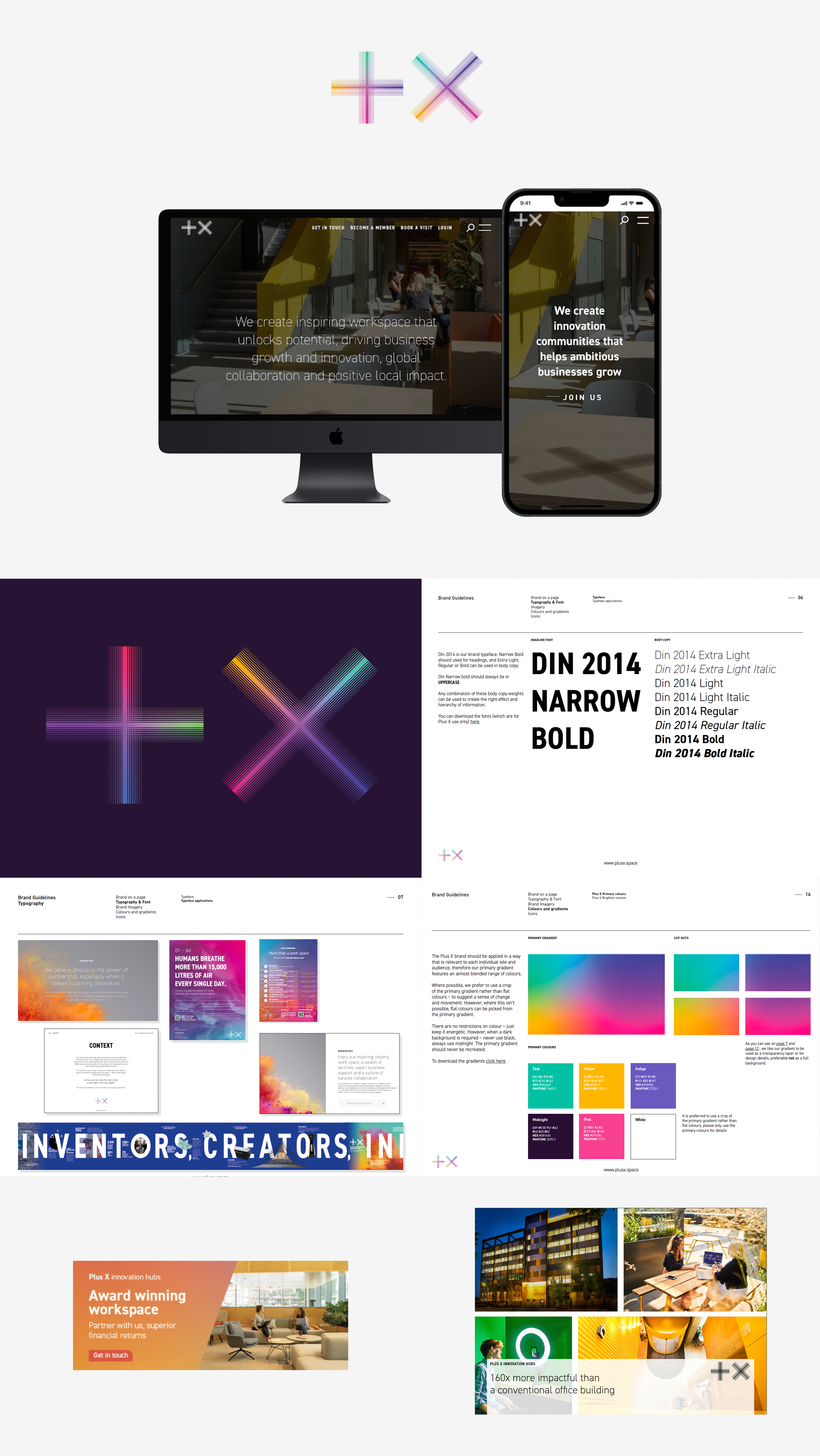
Solution
A holistic approach to the brand, brining together cohesion, creativity and energy to each stage of the customer journey.
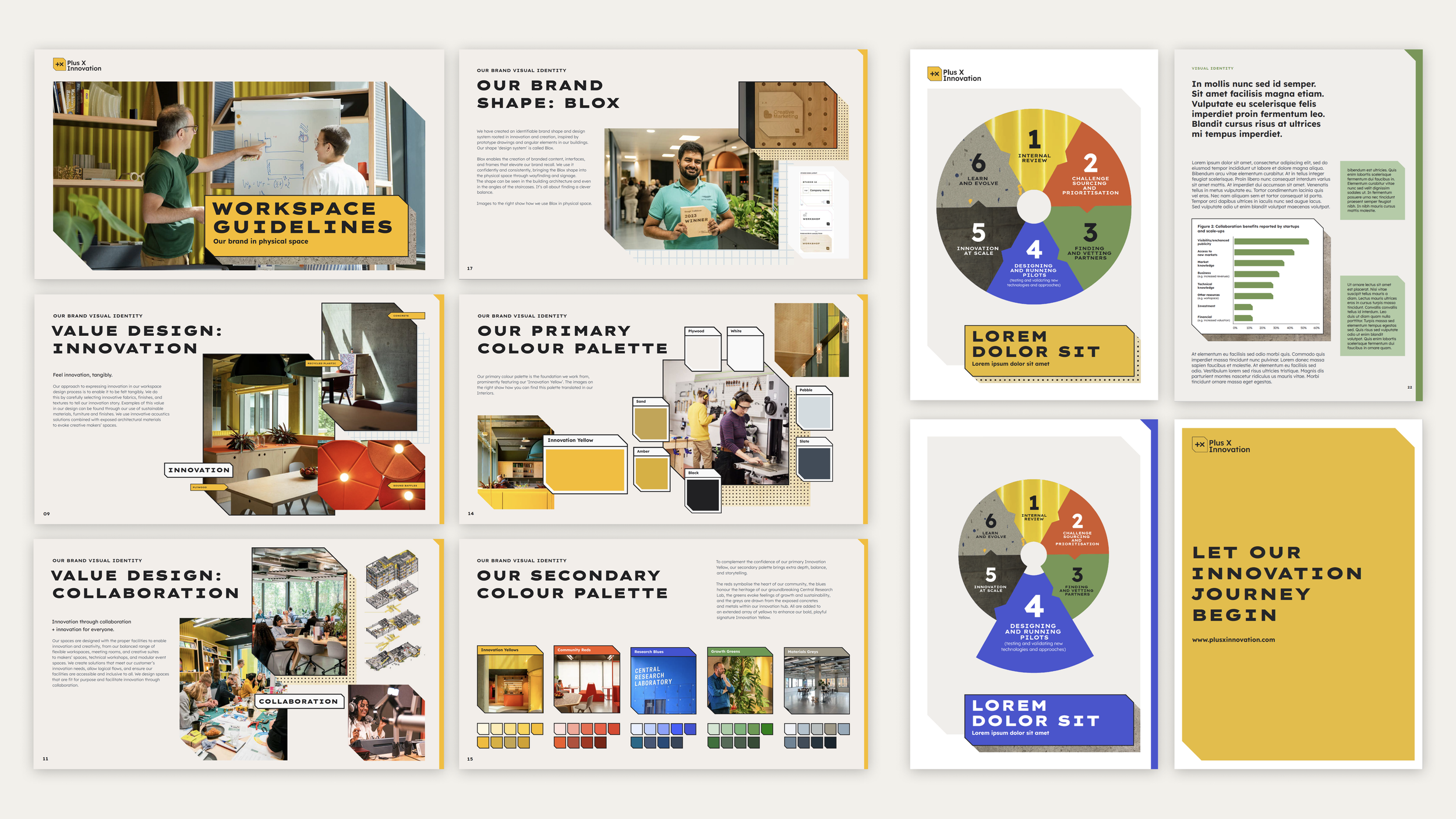
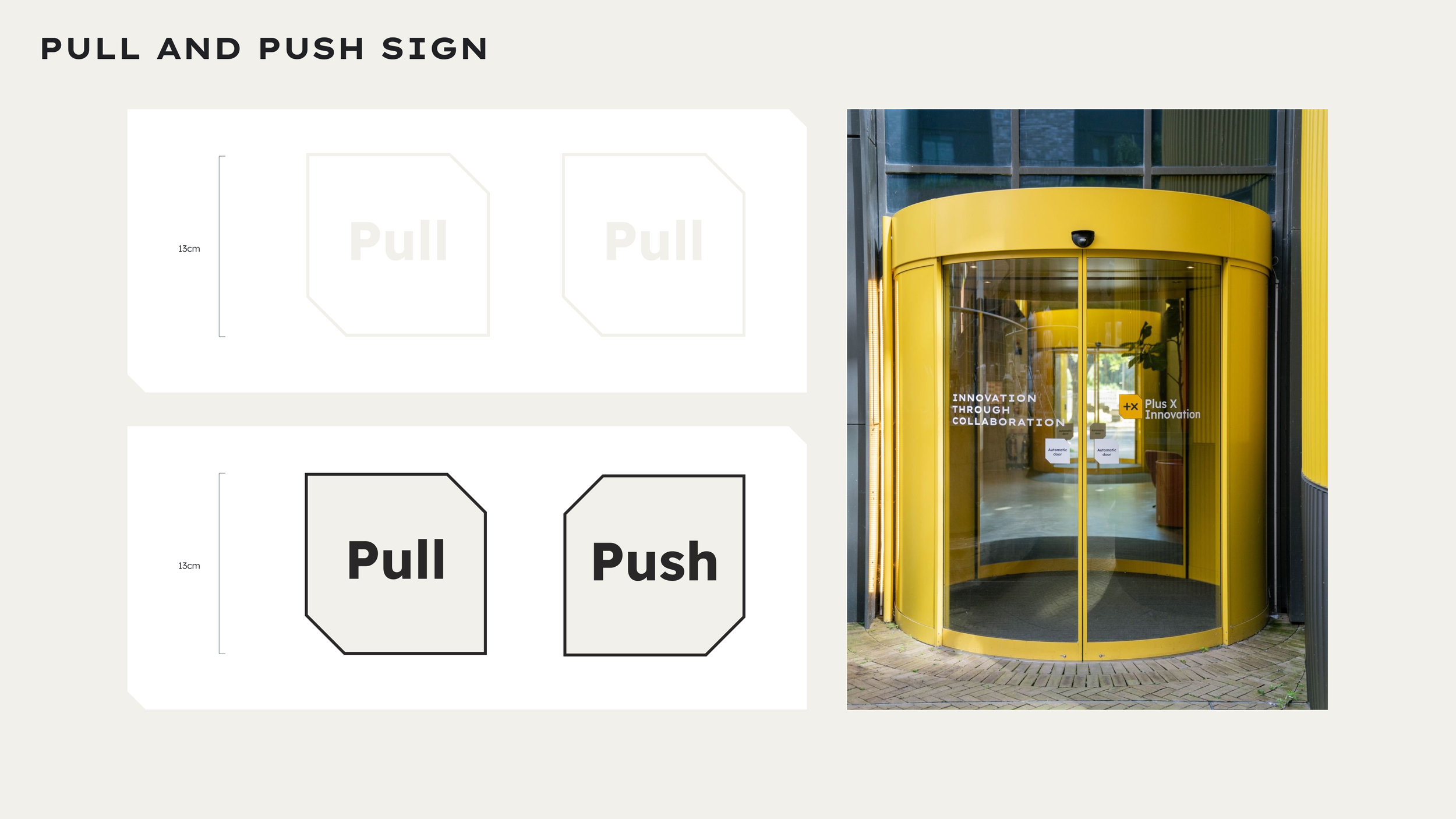
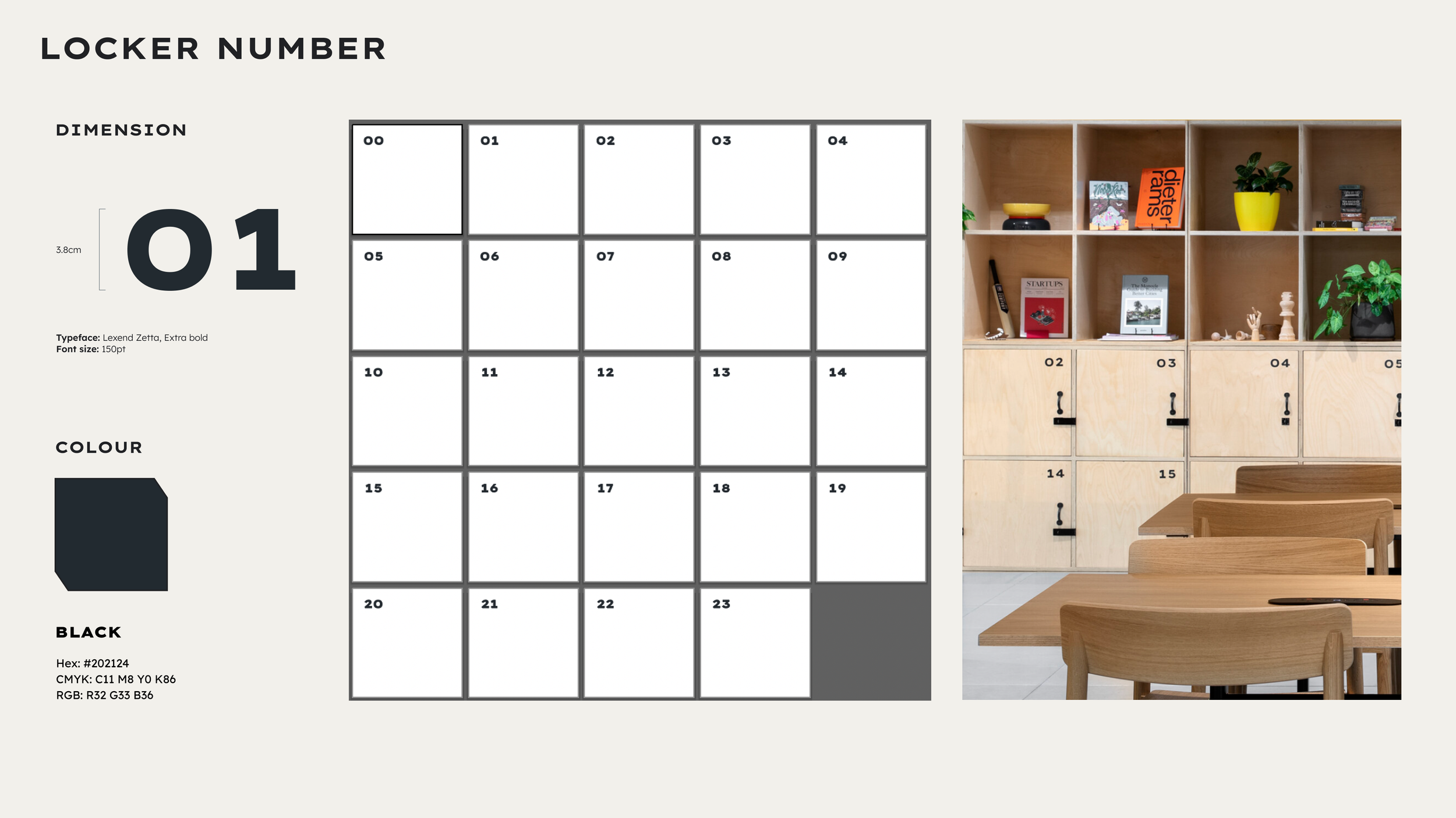
In the new logo and throughout the site, you’ll see the new shape, known as Blox. The idea for Blox came from examining prototyping sketches, the shapes within the innovation hubs, and the machinery within the workshops. This 2D shape has been designed with movement in mind. It can grow, shift to create new forms.
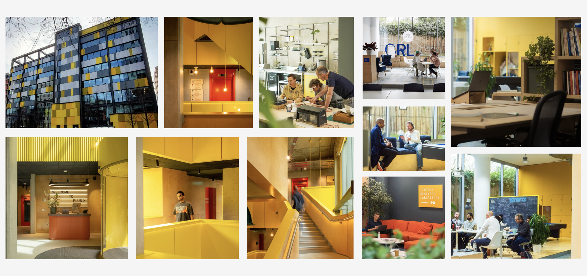
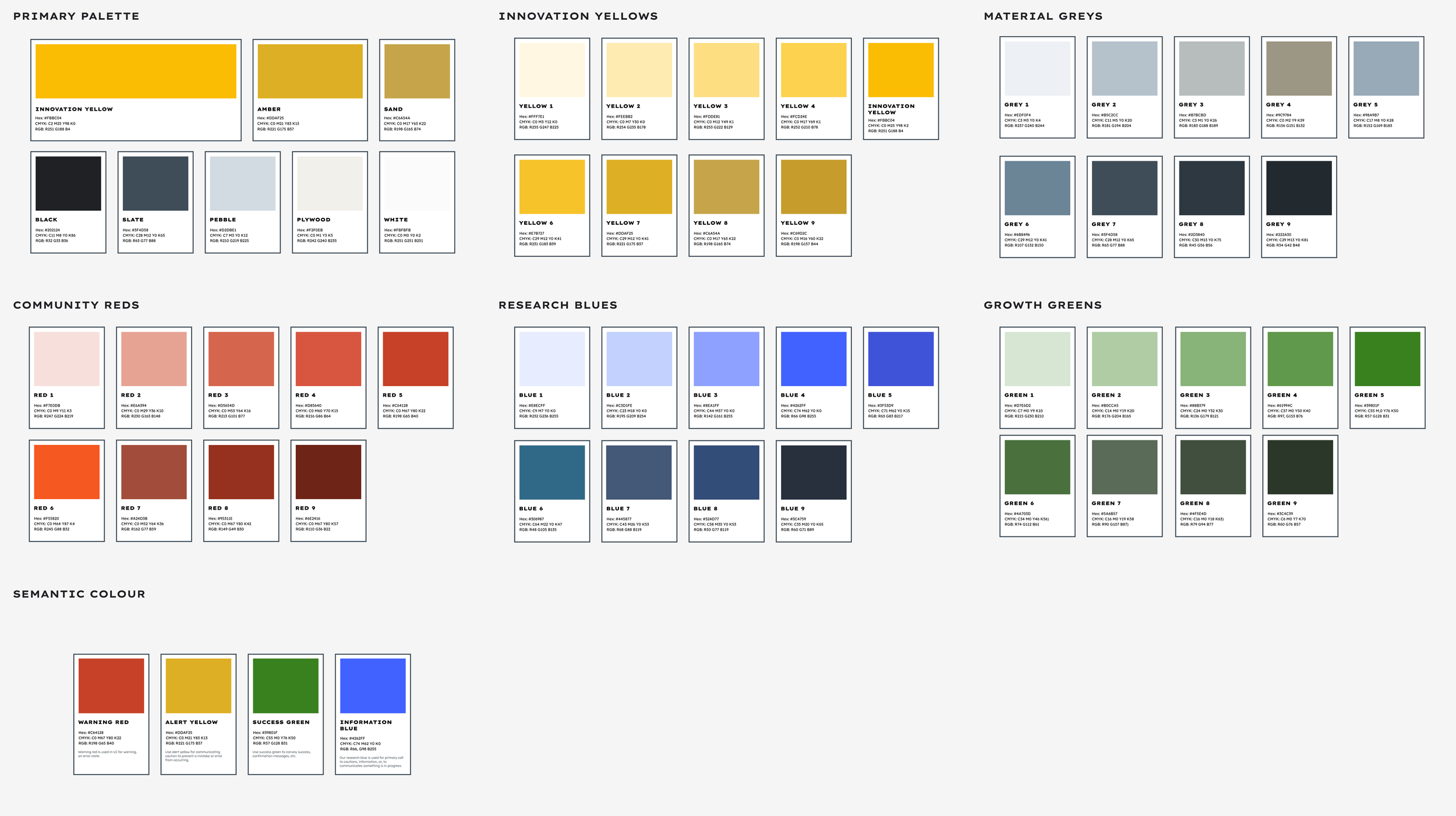
While the previous colour palette was quite varied, we honed in on what we see as Plus X Innovation’s most recognisable colour: yellow found prominently in physical space and innovation programmes.
Selected typeface, LEXEND. Founded in 2000, LEXEND came about from a desire to make reading easier for everyone. As an Educational Therapist, Bonnie Shaver-Troup, EdD, observed that reading issues masked the individual’s true capability and intelligence. She theorized that these issues were a sensitivity to typographical factors and began manipulating multiple text factors to find a match between text format and an individual’s optimized visual processing capabilities.
Website:
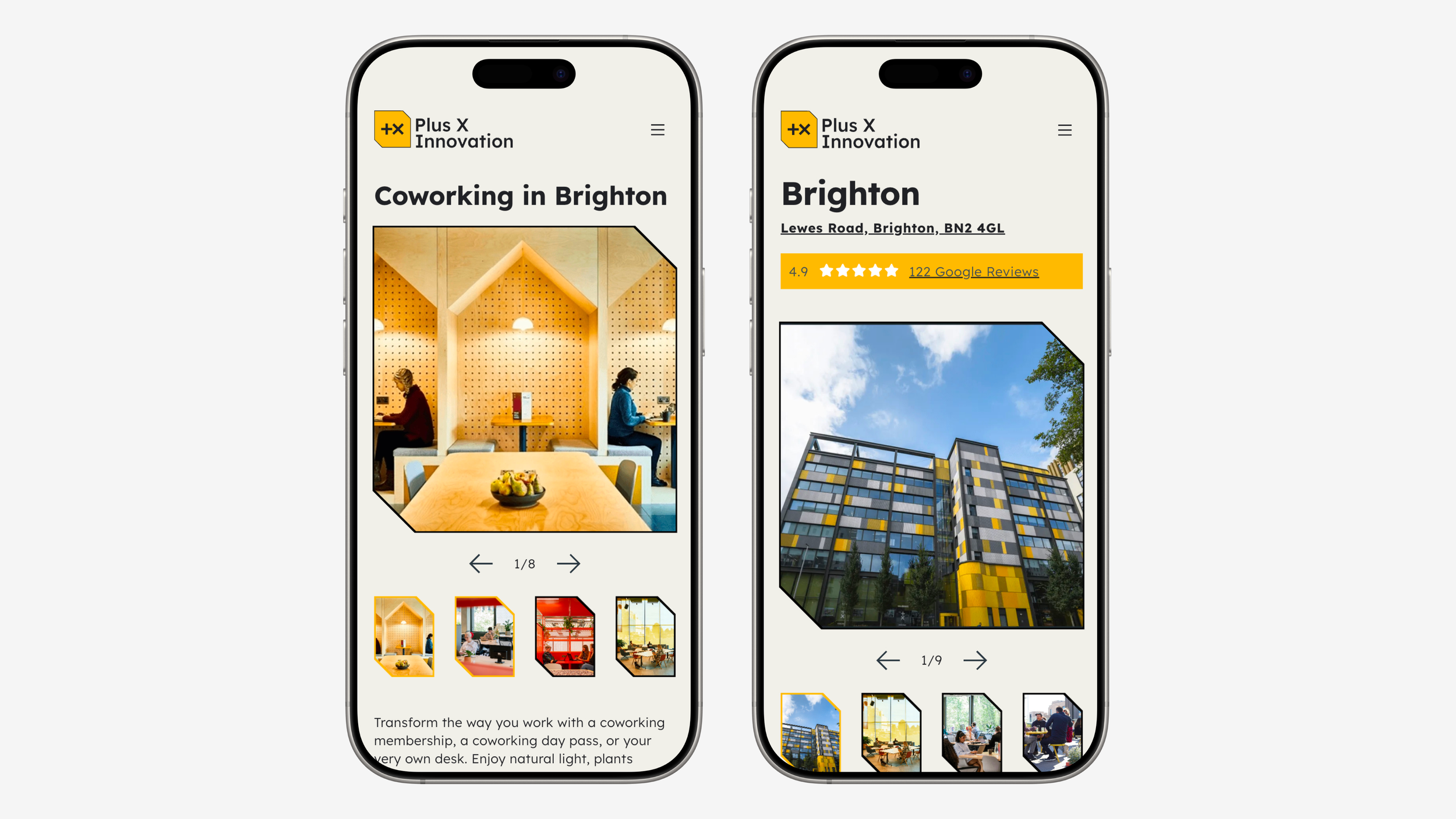
It would have been great to test the website with customers, however we had to settle with UAT team testing due to time constraints on delivery. Despite this, the website increased conversions by 340% from the previous sites combined, showing the value of the pre-stage research. We created a modular design system website that can be simply iterated in the future to increase conversions.
Brand growth:
(November 2023) Plus X Innovation, using the new brand interior guidelines, opens a second location in Slough.
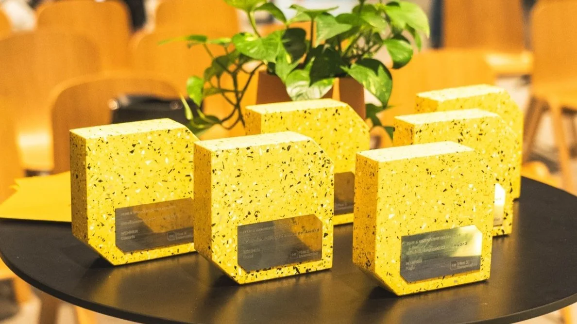
(July 2024) Plus X Innovation wins deal of the year at the Property Week awards
“This pioneering agreement with AshbyCapital embedded Plus X Innovation’s ESG values into its DNA, prioritising design excellence, sustainability and positive social impact. Last week, Plus X Innovation was awarded ‘Deal of the Year’ at the Property Week Awards in recognition for this work.”
(November 2024) Plus X Innovation, Brighton, secures their first commercial enterprise deal
https://internetretailing.net/the-body-shop-returns-to-brighton-roots-as-it-rebuilds-brand/
Solution
Marketing, website and workspace guidelines


Solution
New location launch with workspace guidelines


Explore more work
-
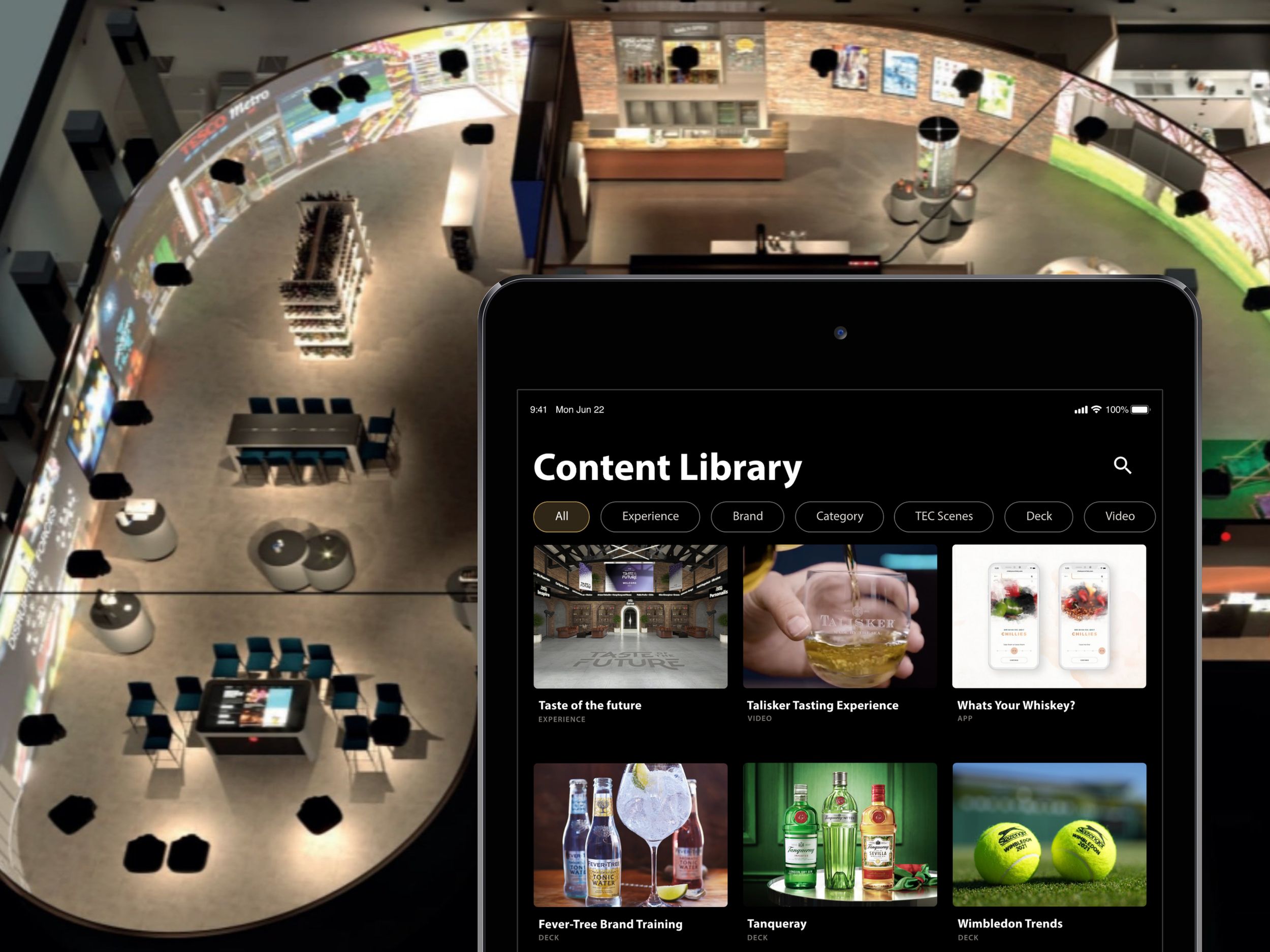
![iPad showing the experience centre's content library, overlayed onto a birds-eye view of Diageo experience centre]()
Diageo
-
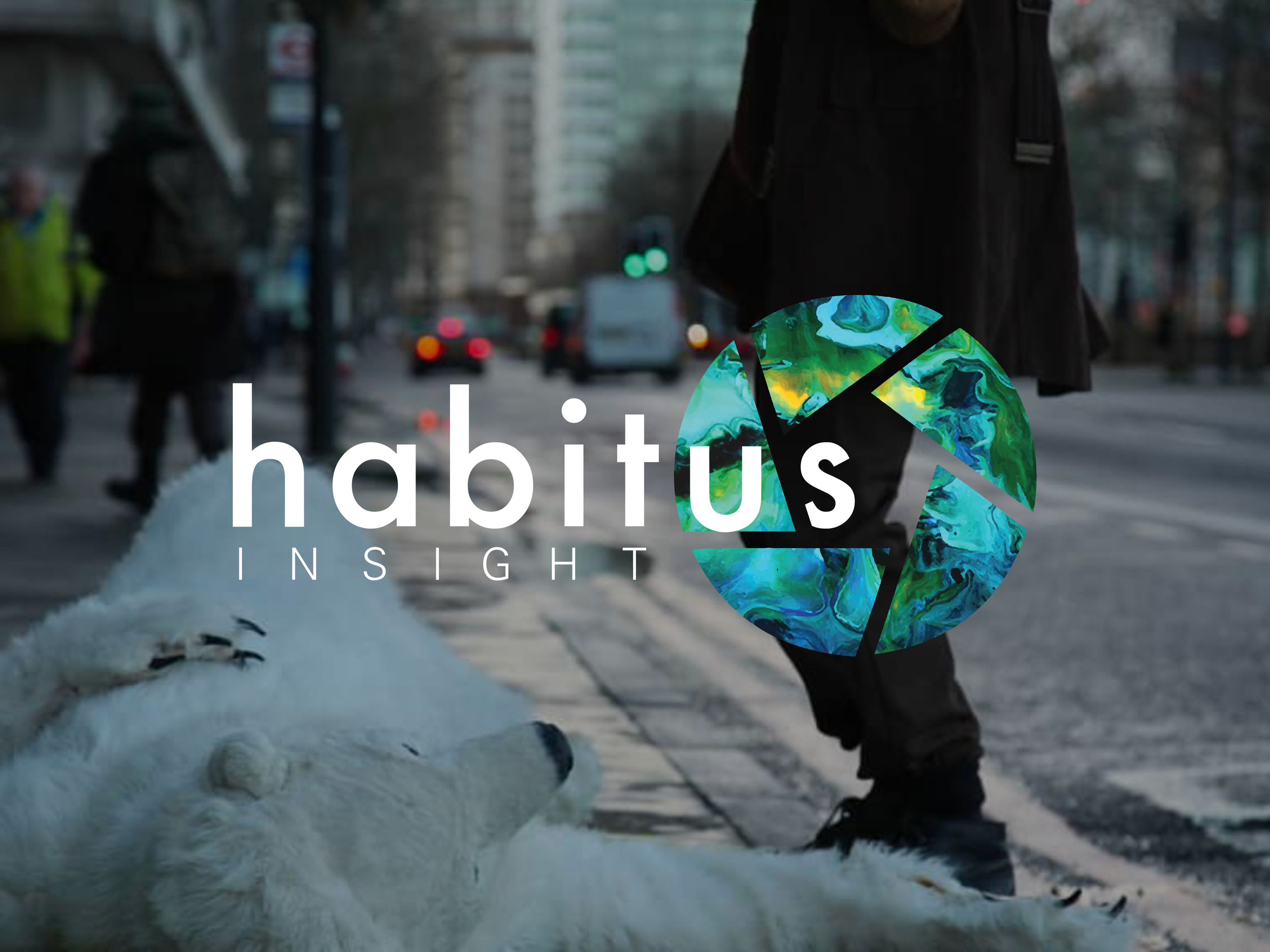
![Habitus company logo overlayed onto a image of someone wearing a polar bear outfit laying on a city street with a person standing over them depicting the climate crisis]()
Habitus Insight
-
![Teacher sitting with child doing school work in a classroom, the Life Lessons logo is overlayed]()
Life Lessons
-
![Iphone screens showing the iterative improvement to IMEX Events websites]()
IMEX Events
-
![3 iPhone screens showing the user journey for a user searching for an event at Kew Gardens]()
Kew Gardens
-
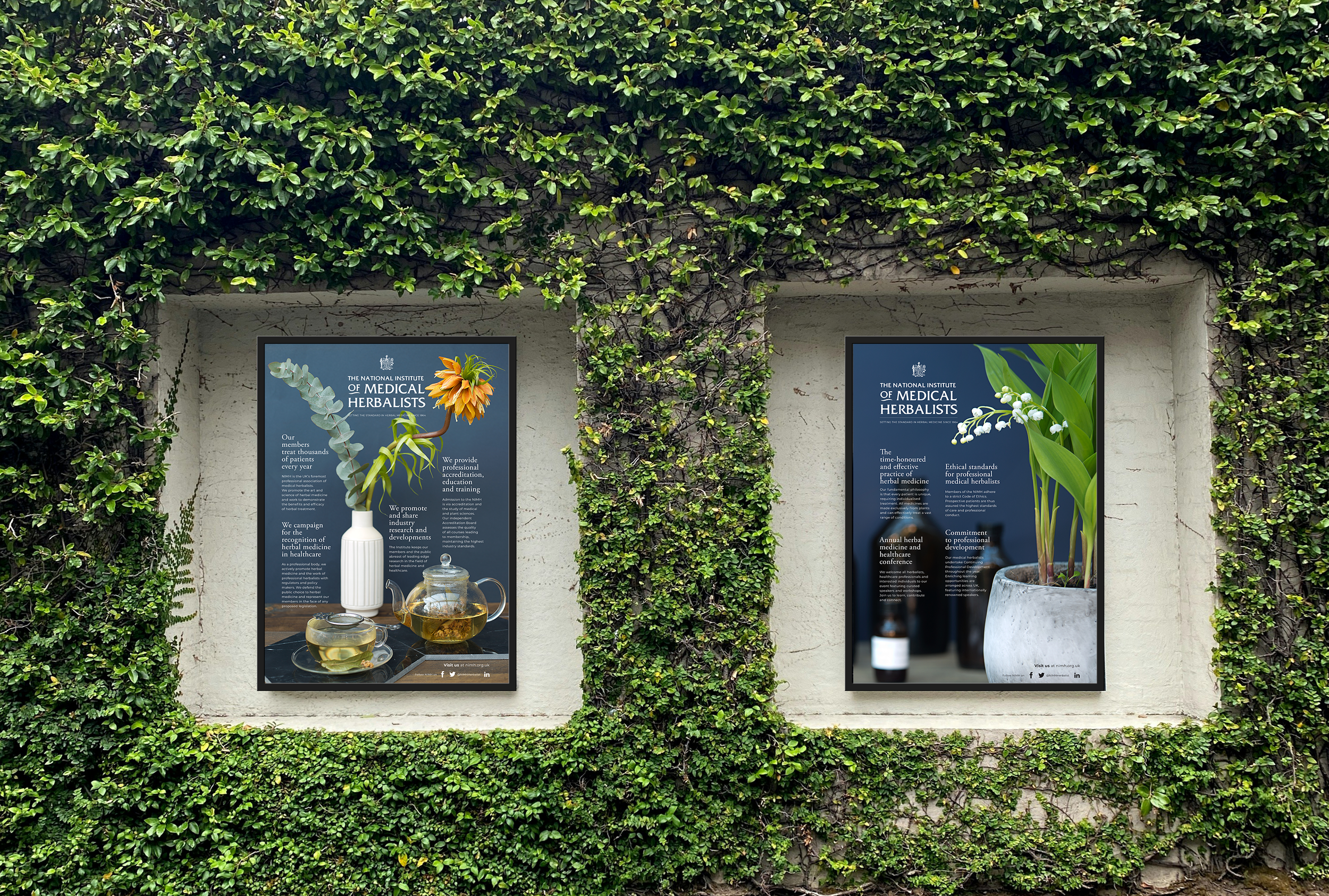
![An outdoor poster showcasing the National Institute of Medical Herbalists]()
National Institute of Medical Herbalists
-
![A large screen displaying the words "Artificial Intelligence" in bold letters.]()
13 Books
-
![A variety of page and poster layouts for UCL culture]()
UCL Culture
-
![iPhone showing Plus X Innovation website, overlayed onto an image of a hardware prototyping lab]()
Plus X Innovation