IMEX Events
Creating 2 websites with a focus on improving exhibitor and event professionals’ journeys.
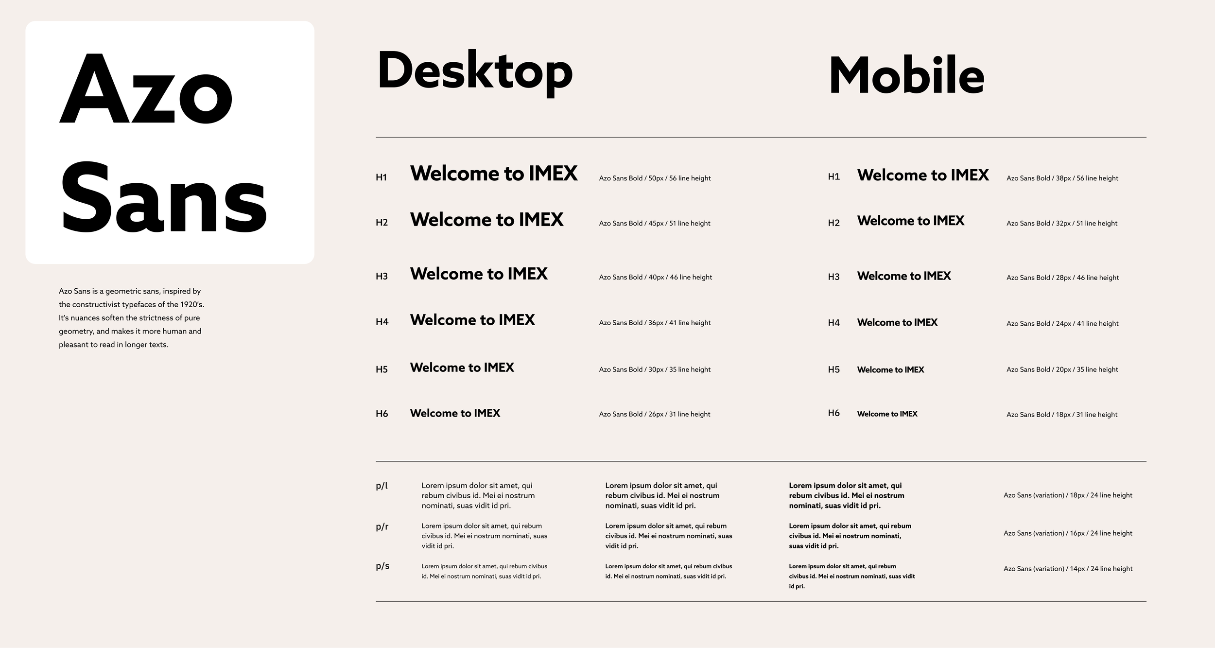
Product & Visual Design

Sector
B2B Events
Service
Product Design & Creative Direction
Target audience
Event Professionals, Destinations, Travel & Tourism
Team
Web Manager (Brand & Product): Myself
Digital Marketing Manager: 1
Head of Design: 1
Interaction Designer: 1
Designer: 2
Senior Editor: 1
Head of Product Technology: 1
External Developers: ExpoPlatform
The opportunity
Migrate and enhance all content from the EventExpo (EP) CMS terminating version 1.0 CMS to the 2.0 improved CMS.
Improve journeys to enhance selling points with clarity.
Organise and appropriate content page structures to avoid duplication and hindering SEO.
Align UI of IMEX websites, creating visual consistency between the website's ecosystem using the recent rebrand as reference.

Approach
Site wide content audit
UX site audit of main customer journeys and user flows research (Event professionals and exhibitors)
Google analytics audit research (bounces rates, session times, journeys)
Competitor analysis research (IBTM, World Travel Show, Confex, The Meetings Show)
Brand customer journey audit research (touch-points email, social, onsite experience)
Copywriting audit and adaptation to UX conversation copy
Usability UI audit (No UI documentation or approach existed)
Wire-framing
WCAG 2.0 compliance UI recommendations
High-fidelity prototypes
Flow analysis
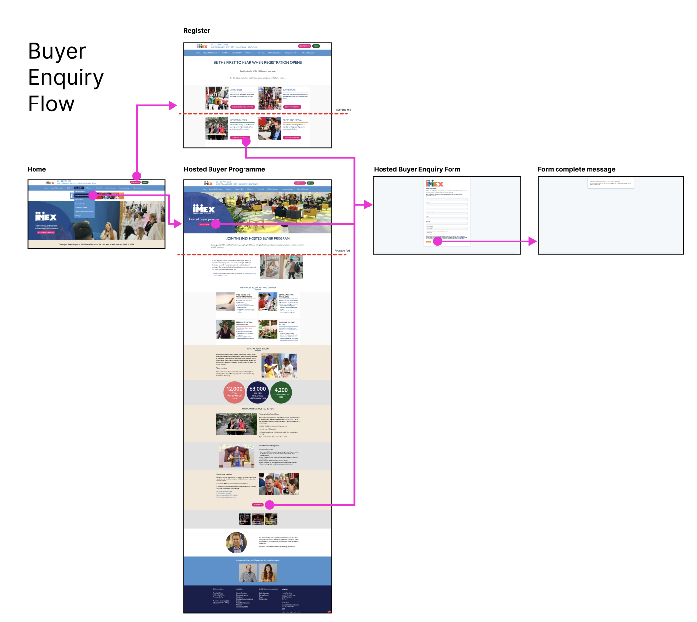
Buyer enquiry flow example
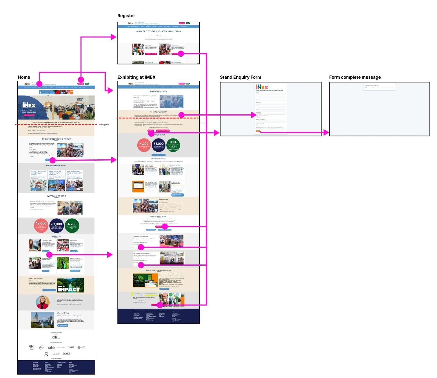
Exhibitor enquiry flow example
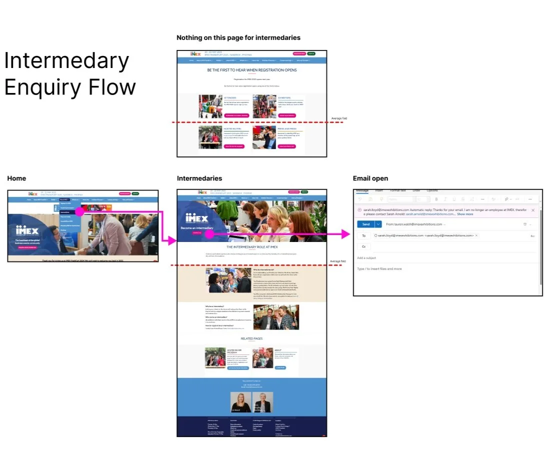
Intermedary flow example
Solution
Data collection: Exhibition enquiry, buyer applications and newsletter signups opened as tabs with single page forms, this approach made the website conversion journey feel untrustworthy with GA data showing high drop off from page to form completion. To improve conversion analysis, build trust and provide users with expected web behavior, embedding these into the site, adding form completion links back to relevant areas of the site.
Brand identity audit: Through analysis of customer journey from top of the funnel to at event creating a fluid experience between the 3 websites.
UX, UI and content audit:
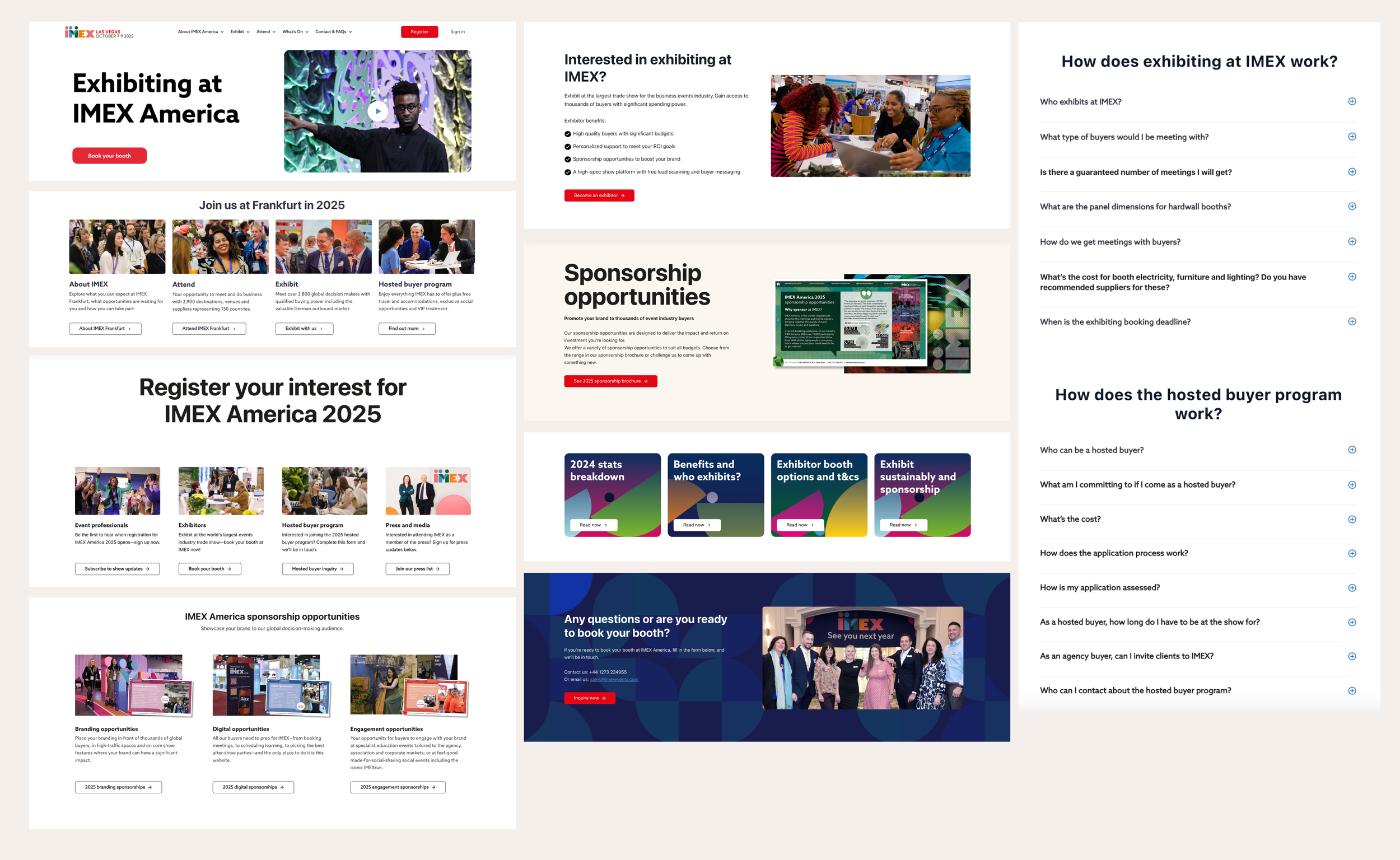
Homepage: Recreating page flows, content and strategic CTAs.
Buyer pages: Enhancing pages with content for customers in pre-purchase, research and discovery mode.
What’s on & schedule at a glance: (high traffic on GA) - Redesigning pages using expected UI, dividing content onto days from PDF brochures, adding cards for event listings.
Exhibitor pages: Adding booth booking CTA to header to allow for a quick inquiry journey (previously many blocks down the page). Adding in further testimonials for social proof.
Site wide removing large volumes of text: Into succinct sections, reducing scroll depth and increase cognitive load.
Cross site brochure-web audit: Removal and reworking PDF’s into web-friendly formats using UX and accessibility best practices
Outcome
2 websites launched in 2024 on EP 2.0 within expected timeline ahead of EP 1.0 development closure, with improvements in UX, UI, content and brand. Based on the short turn around time, the team felt it best to remove testing with customers, instead with internal teams. This would be an insightful improvement for further iterations.
Simplified user journeys, removing bounce outs.
Styled patterns within the CMS for the marketing team to drag and drop with further site development
Delivery of a detailed product design audit document for further digital product for the product, UX, design and marketing teams.

Solution: Flow improvement example
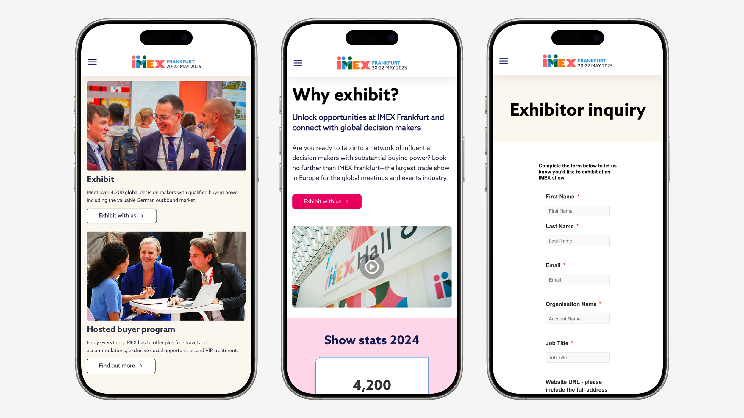
Placing exhibiting content clear and accessible on the homepage, for users that enter through home.
Placing ‘exhibit with us’ call to action button above fold for clear access to exhibitor inquiry.
Embedding form to page, with clear page heading increasing trust and conversion.
Patterns
Explore more work
-
![iPad showing the experience centre's content library, overlayed onto a birds-eye view of Diageo experience centre]()
Diageo
-
![Teacher sitting with child doing school work in a classroom, the Life Lessons logo is overlayed]()
Life Lessons
-
![3 iPhone screens showing the user journey for a user searching for an event at Kew Gardens]()
Kew Gardens
-
![Iphone screens showing the iterative improvement to IMEX Events websites]()
IMEX Events
-
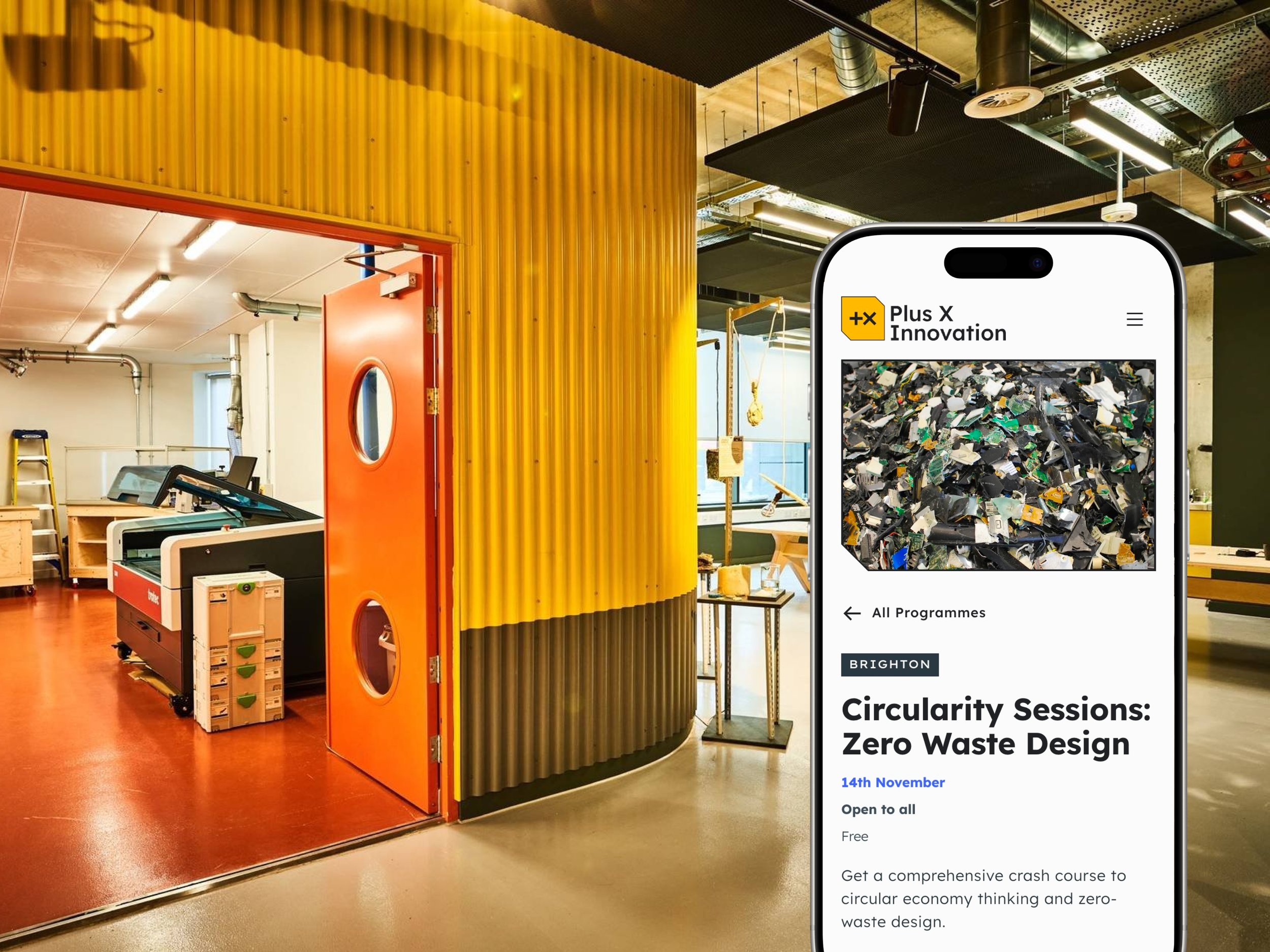
![iPhone showing Plus X Innovation website, overlayed onto an image of a hardware prototyping lab]()
Plus X Innovation
-
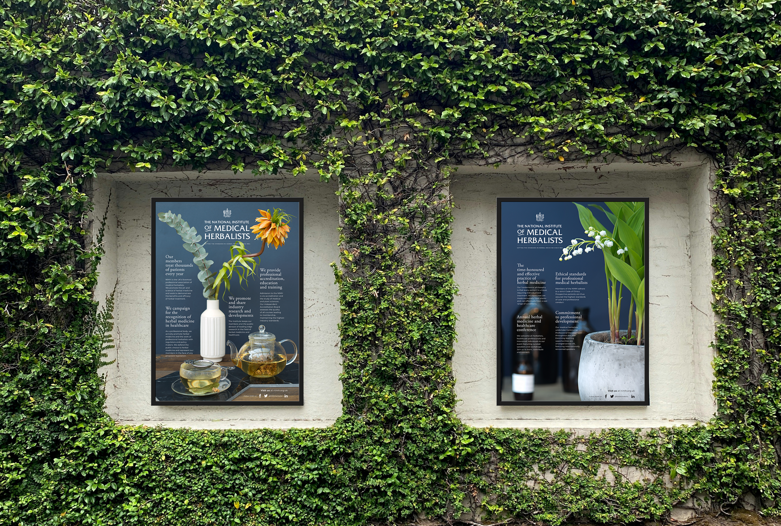
![An outdoor poster showcasing the National Institute of Medical Herbalists]()
National Institute of Medical Herbalists
-
![A large screen displaying the words "Artificial Intelligence" in bold letters.]()
13 Books
-
![A variety of page and poster layouts for UCL culture]()
UCL Culture
-
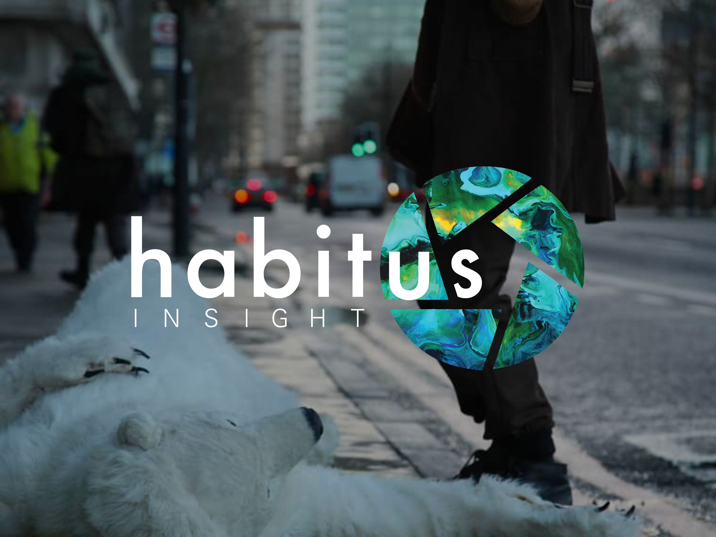
![Habitus company logo overlayed onto a image of someone wearing a polar bear outfit laying on a city street with a person standing over them depicting the climate crisis]()
Habitus Insight